Content-first design: better guidance for users
The problem: Babbel learners were giving consistent feedback in interviews that they wanted to know more about the Babbel Live class experience before they’d be comfortable booking a class.
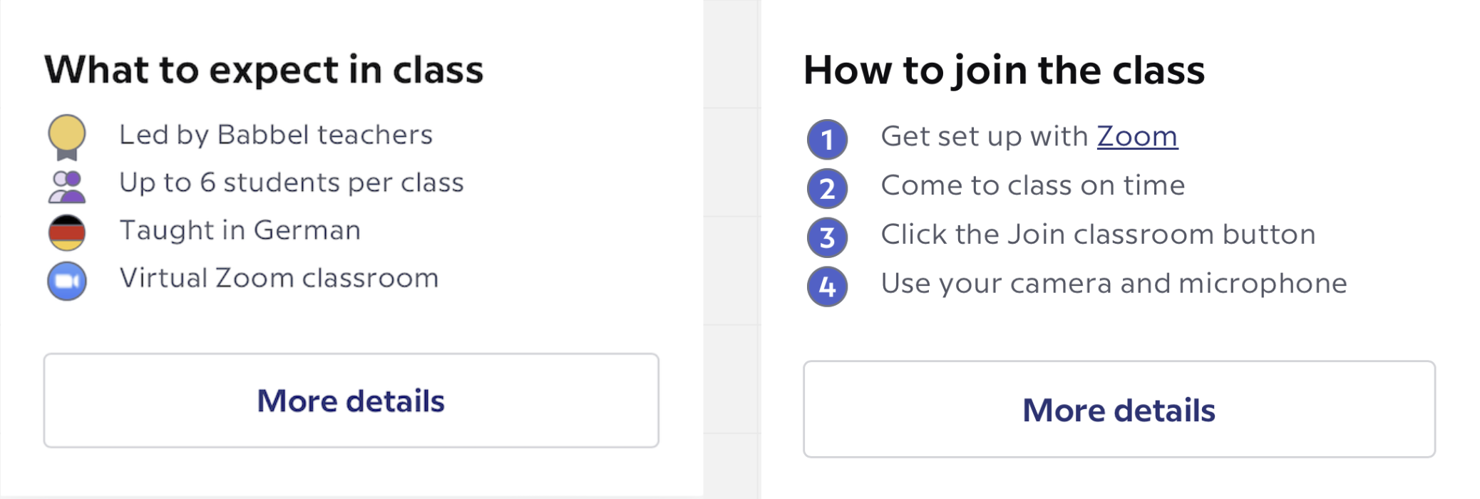
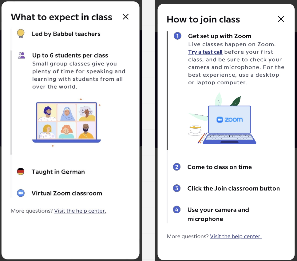
The solution: A card with key information about Babbel Live classes displayed on the class booking page. The CTA on the card opens larger popups with more in-depth information learners might want before and after booking the class.
How we got there: Starting with a Google doc, I wrote a couple of pages explaining the Babbel Live class experience, focusing on answering the specific concerns our learners were bringing up in user interviews. From there, my product design partner lay out the content in different formats until we decided on the current card and pop-up components.
The biggest challenges: We started with the written content and let it inform the rest of the design, at first envisioning a landing page layout. After socializing the designs, we realized it was too much text and continued ideating. Each time the product designer changed the layout, I cut more text. By the time we reached the current pop-up format, we’d cut most of the original content, but worked together to strategize what was most important to keep—what would answer the most urgent questions new learners might have before their first class.
The biggest win: Seeing my idea come to life through a content-first process. I pushed for a solution that would offer new learners more guidance with a low amount of engineering effort, so we started with the content first. That eventually led to a more complicated solution, one that brought much-needed information to new learners.

